This week, it's part two of a series on crafting great landing pages. Let's review:
- Include only pertinent content
- Try for consistent wording and images
- Get to the point
- Tailor your landing to their source
- Eliminate your usual website navigation elements
- Tell the viewer exactly what to do
Look back at the earlier post on landing pages and you'll see some discussion of each of these points.
Searchers become researchers when they click on your link. It's your 10 seconds to set the hook! If the visitor doesn't find the answers to her questions in a very short time, she's back to deep water.
Now, onward to more essential elements of excellent landing pages.
1. Don't hide the gold in a pile of prose
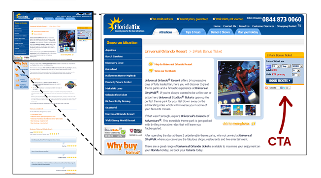
Figure out what your most important message is and place it right up front. Even long-form pages like Amazon uses to describe products has been edited to keep THE most sought-after information right at the top. I know you have a lot to say about your fantastic product, but the more your visitor is asked to read, the less likely he or she will get to the CTA (call to action).
2. Keep it above the "fold"
The fold is the point at which the user must scroll down to see more. Think of it as the fold in the middle of a newspaper. Again, this is an enterprise where milliseconds count (see our blog entry). With the invention of the wheel mouse and the touchpad, this principle is less important, but test it anyway. View your landing pages on a variety of monitors to see where the fold breaks and design all your material to sit well above the line.
The exception: you may have a marketing strategy or message that requires long-form design. The consumer may not decide to buy until well down into screen three. Do you really want them to have to scroll back up to the top to click on the CTA? No. An easy solution is to simply repeat the CTA prompt several times on the way down.

3. Use Video or Audio
As long as we're making things ridiculously easy for your landing page visitors, consider using video or audio. It's a bit easier on the brain to process visual or auditory information, and there's so much you can do with it. Think through your production values - is it more appropriate to have a high-quality, polished clip, or would a low-fi profile of the product or service do the job? The advantage of the latter is that it tends to reinforce authenticity and identification with everyman. If you're a bigger business or your product wouldn't sell with a down-home approach, definitely put more into the lighting, staging, acting, etc.
4. Give it Shareability
Imagine what it would be like if your landing page went viral. Often, virality happens by accident, but by studying what makes something ripple across global social networks, your campaign could be the next "Ship my pants" (Kmart) or "Test drive" (Pepsi Max).
Why not include links to Facebook and Twitter? If you have a piece that your loyal customers are proud to feature on their feed - who knows?

5. Say Thank You
Your mother was right. Saying thank you is simply the right thing to do. So when your visitors click your CTA or fill out a form, make sure they are appreciated. Give them a surprise freebie like a coupon, a discount code on their next order or a link to a white paper.
Here’s to happy landings for all those who search for you!

