Savannah GA may not be the biggest city in the U.S. but it doesn't mean it lacks web design talent. While lots of website design companies are promoting mobile websites, a few Savannah web design firms are providing their clients with responsive design sites that automatically reformat themselves to fit the device they are being viewed on.
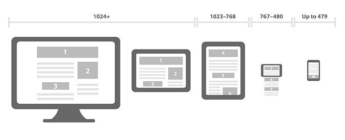
At first blush this does not seem like such an incredibly important design feature. After all most websites look ok on a variety of monitors and laptop screens. That same monitor/laptop appearance looks ok on a tablet too. Why not just have a nice look for these devices and another for a mobile phone?
A few years ago you might have had a point, except even back then a phone turned sideways has a much different width than one held straight. Same goes for tablets. These days, however, tablets displays range in size from 7 inches to 13 inches and mobile phones have a substantive swing in available sizes too. Flip those sideways and display size options double.
While this infographic does not begin to address ALL of the permutations in size we have today, it does demonstrate the value of responsive design.
Several Savannah Web Design Companies are developing sites with responsive designs, our firm included and we hope this becomes the new norm for our industry soon. Why do we care?
Responsive design sure is spiffy. If you open a website built with responsive web design on your computer you can resize your web brownser window and watch the design reformat automatically. Check our site out for example. Cool right? So what? Unless you are in the business of being spiffy it's not really that important is it?
Wrong again. If you open a website on your phone and have to pinch the screen to read the website or constantaly swipe the screen to move the content into a readable area, are you going to stay on that site very long? Of course not, it's annoying. And you are not alone.
People spend lots of money on Search Engine Optmization or Pay Per Click to get as many visitors as they can to their website. Imagine making investments in web traffic only to have that traffic leave you immediately because they cannot easily read your marketing message. If a website is not comfortably viewed on every size device of the potential audience is reduced, bounce rates increase, and page views go down.
It is all just part of what should be a design axiom for all websites, usability. Every business wants the most beautiful, professional, engaging, and/or creative presence for their website. Some times we see the creativity extend into navigation, with their products or services link called something like "our passions" or "solutions". To the designer that is "edgy" but people looking for products or services find it confusing. It still surprises me when we see a site promoting a professional service without including the business phone number, in an obvious place. If they built a website with 1/2 the aesthetic quality, that has clear navigation, obvious actions the visitor should take and the benefits for them taking them, that "ugly" site will bring in double the business probably even more.
And that is why responsive web design is so important. Evey person on every type of computer, laptop or mobile device can easily see your navigation. They can easily find your marketing message. Assuming your site objective is to have visitors call, instead of make a purchase on the site for example, and your phone number is displayed on your site, they can quickly find that too. If they are on a mobile phone they can call immediately just by touching the phone number.
Responsive design is just one of the things this Savannah Web Design company includes on all their new sites. Not because it is spiffy or cool, but because it increases your chances for success.