Savannah GA may not be the biggest city in the U.S. but it doesn't mean it lacks web design talent. While lots of website design companies are promoting mobile websites, a few Savannah web design firms are providing their clients with responsive design sites that automatically reformat themselves to fit the device they are being viewed on.
At first blush this does not seem like such an incredibly important design feature. After all most websites look ok on a variety of monitors and laptop screens. That same monitor/laptop appearance looks ok on a tablet too. Why not just have a nice look for these devices and another for a mobile phone?
A few years ago you might have had a point, except even back then a phone turned sideways has a much different width than one held straight. Same goes for tablets. These days, however, tablets displays range in size from 7 inches to 13 inches and mobile phones have a substantive swing in available sizes too. Flip those sideways and display size options double.
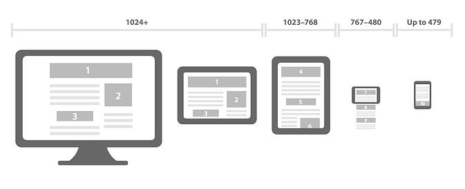
While this infographic does not begin to address ALL of the permutations in size we have today, it does demonstrate the value of responsive design.

 No, I am am not suggesting you sell your cat on the internet. But if you really DID want to get rid of "Mittens" in exchange for some financial recompense, this blog post will help you ( although that is really NOT the point ). Regardless of your affinity for your feline this article will show you how you can use your cat, or almost any other pet, to help you drive new revenue to your business with internet marketing.

 Whether you are thinking about your very first website or you are looking to have your current one redone, proper website design planning pays big.
